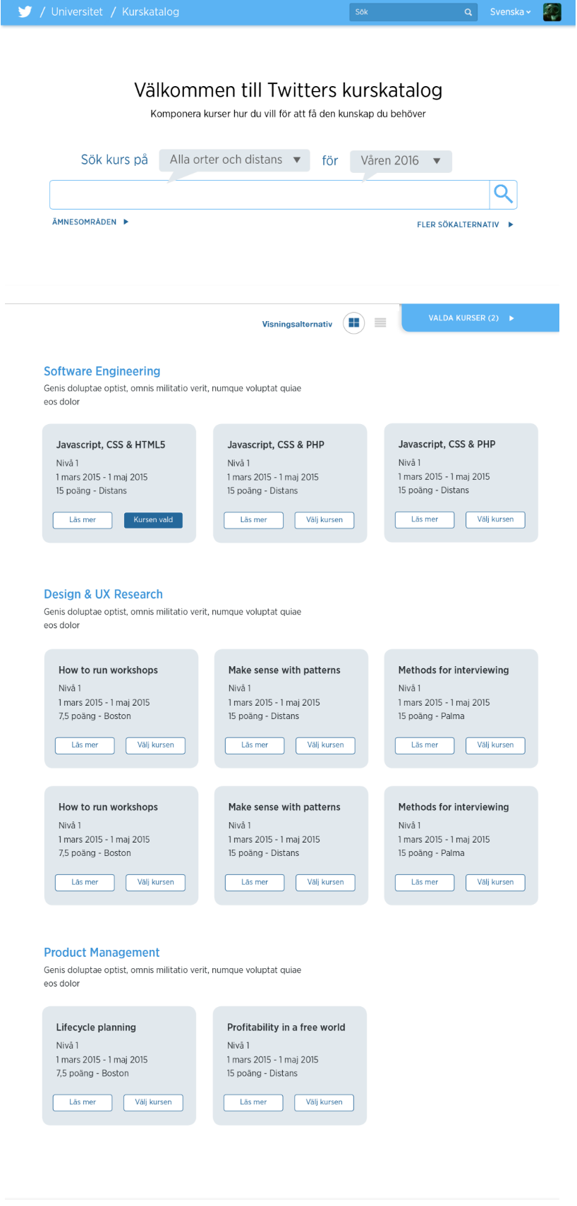
Twitter Uni course catalogue:

Mission:
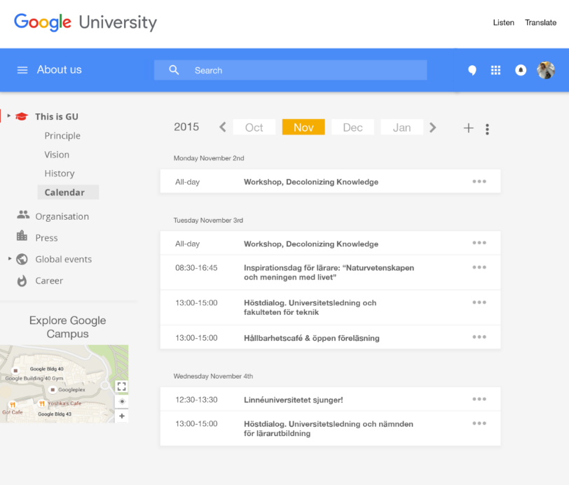
If Google and Twitter were universities how should they graphically look like? We were given what content should be on the pages.
Resources & Tools:
Me, UX pin and InDesign
Solution:
I studied Google and Twitter pages to understand how they use graphics in different contexts and how they present different kind of content. Based on this I put up designs in Indesign which then were transferred to UX pin.
Google Uni event calendar:

Twitter Uni course catalogue:
